Test Design: The Official Doc
If you are running a testing program, then you’ve more than likely had to think about what should go into a test you are running. This could include the problem statement, your hypothesis, how many variants, how different these variants will be, what your measures of success will be, screen captures, and more.
It’s important to create a doc or some sort of accessible page/application for your teams to be able to reference this information. This helps to foster and open and collaborative culture of optimization. It will also help you as you look back to understand what your test objectives were and how the test did compared to those objectives.
I track all of this via a Google Doc for each test I run. I used the same template for each test as well, which is important for a couple of reasons. First, it ensures you are always thinking about, setting up, and tracking the same metrics. Consistency in what you are tracking and measuring success against is key to comparable growth over time. And secondly, it’s a very easy format to share ideas, collect commentary, and be a universally accessible place for my organization to go to find information on tests that we’ve run in the past.
Currently, I’m running a test on my sister Jilleen’s blog. We have a mutually beneficial relationship here… I get to test out, play with, tweak, and potentially break (no shhhhhh I didn’t say that!) her site, and in exchange, she gets me as her analytics and optimization manager. I’m not sure she realizes that big companies pay big money for these types of consulting services… but anything for family!
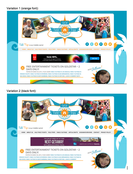
The test I’m currently running is an A/B/n test looking at font color on her global navigation bar. The default color is blue, matching a lot of the rest of her site. But there is also a good amount of orange on her site, as well as black, so I decided to see if I could impact engagement with the nav bar (increase click-thru to other site sections or pages) by changing the font color.
Site engagement is important for Jilleen’s site for a couple of reasons:
– she uses ads to monetize her site
– she wants users to see and understand the variety of content she offers in order to reach several different interest groups and increase loyalty and return visits
– she’s constantly producing a lot of awesome content for Moms and families and wants it all to get seen
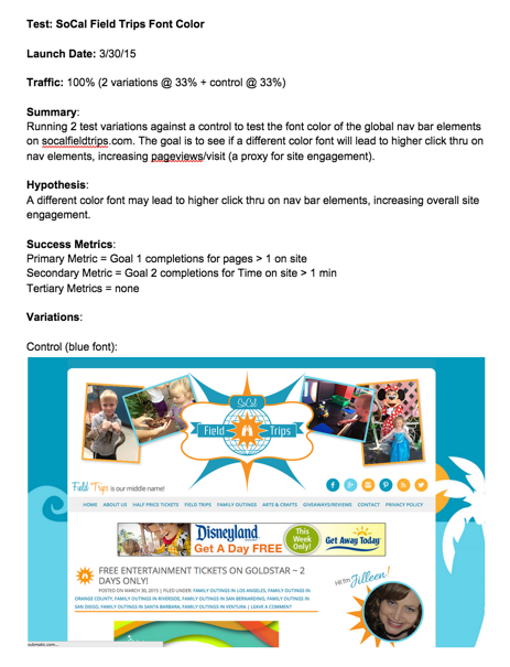
To document all of this, I’ve put together a test design doc that looks like this:

You can see the full test design doc here.
Feel free to make a copy of this and use it as your standard template (and/or tweak it to work for your website or organization).
Happy testing!

Martin
Hi Krista
This is very useful, thanks for sharing. I’m a bit of a newbie in this area and have a bit of a newbie question:
What does “Traffic: 100% (2 variations @ 33% + control @ 33%)” mean?
Cheers
bloggerchica
It’s referring to how much site traffic you are putting in the test per variation. So in this case, the test is running on 100% of site traffic and that is split evenly between 2 variations at 33(.333)% each and a control version of the site also at 33(.333)%.
Martin
Got it, cheers!