Step by Step: Setting Up a Google Analytics Dashboard
Do you need to look at the same metrics or report on a regular basis? Do you want to share the same report across a broader group of stakeholders? Do you want to have the flexibility to change the date range for the whole report or segment it down to certain demographics or characteristics? Great – you can do all of that with a Google Analytics Dashboard!
In this quick post I’ll walk you through the easy step-by-step process of creating a new Google Analytics Dashboard.
Step 1: Creating a new dashboard canvas
Decide whether you are going to create a new dashboard from scratch, or if you will add reports to a new dashboard from the regular reporting UI. For right now, let’s start from scratch. Later in the post I’ll show you where you can quickly add your favorite reports to a dashboard from the interface.
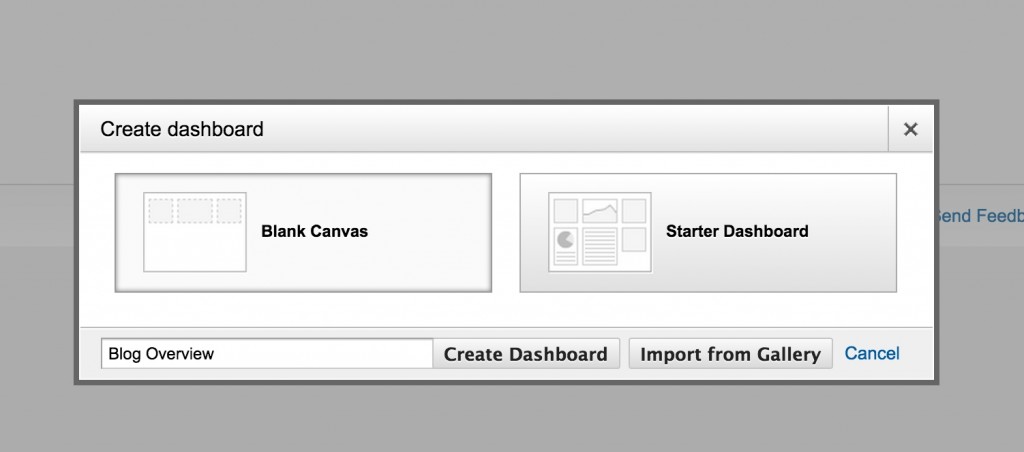
Once you’ve decided to start a new dashboard from scratch, you’ll need to navigate to the dashboards section in the left-hand nav bar of the GA interface and select ‘New Dashboard’ and ‘Blank Canvas’. Then name your dashboard and select ‘Create Dashboard’.
Step 2: Add a Widget
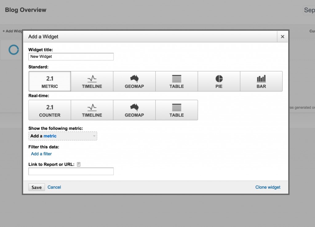
This is where all of the magic happens (and also the difference between a ‘do it myself’ and ‘add to dashboard’ widget). When you are creating a new widget, you must decide whether it will be a graphic (such as a map, chart, or timeline), or a table (list of metrics/dimensions and values).
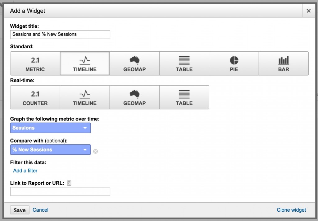
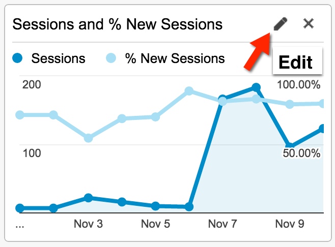
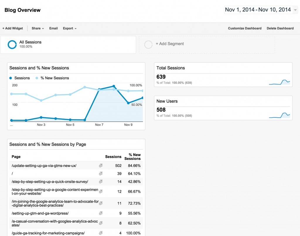
For this example, let’s create a time-series chart (timeline) comparing sessions (visits) to % new sessions. In other words, a visual of how new vs all visits for your site looks. I recommend that you name the widget according to what you are actually graphing so it’s very clear to whoever is looking at the dashboard.
You have the option within each widget to filter it down at the widget level, so if you wanted to show only session data for a particular country, for example, only US sessions, you could use that filter option to do so (and notate in the name that it is US only). These filters will only apply to the widget, not to the whole dashboard.
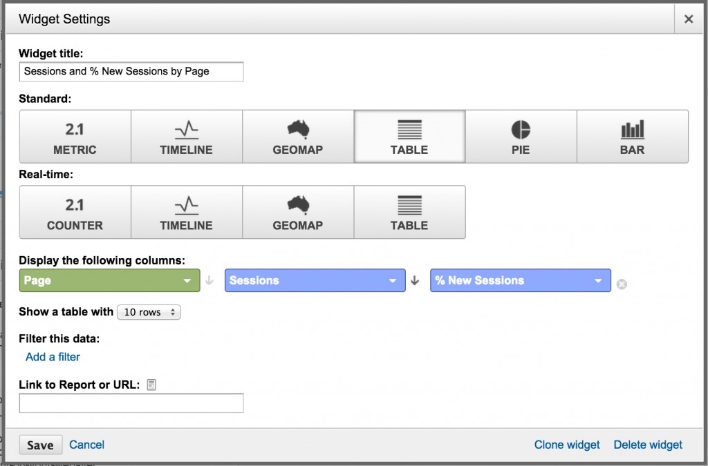
Often times I will actually make 2 widgets, one for a timeline, and one for a table and stack them on top of each other in the dashboard for clearer data analysis of the same metrics. Thankfully, it’s really easy to do this! If you would also like to display this same information in a table form, simply choose ‘Clone widget’ on the bottom right hand corner of the widget window. This will create the exact same widget in your dashboard. Then all you need to do is click into the second widget to edit and change the display from ‘Timeline’ to ‘Table’.
Note that in a table, you will need to specify a Dimension along with your metrics, so in this case I’ve decided to look at ‘Page’ as a dimension broken down by ‘Sessions’ and ‘% New Sessions’ as the metrics.
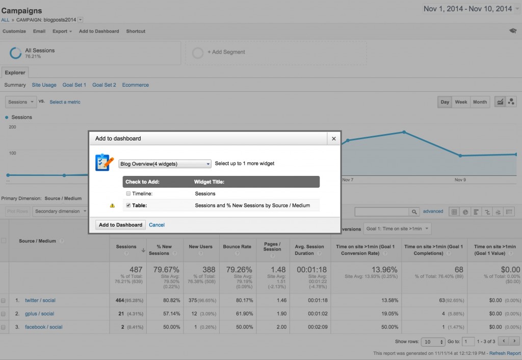
I mentioned there is another way to add widgets to a dashboard. I’d say it’s definitely the faster and more robust of the ways as well. From any report you are looking at in the GA interface, you can click ‘Add to Dashboard’ in the top nav bar. This will bring up a popup that allows you to select the table, chart, or both, and which dashboard to add these widgets to.
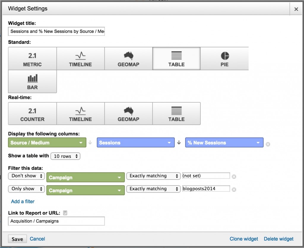
If you were then to look at how the widget was setup, you could see what goes into this report:
Like I said, I prefer this method as I can get exactly what I’m expecting to see (same as the report I just ran) and the widget is created for me. So simple.
Step 3: Organizing your dashboard
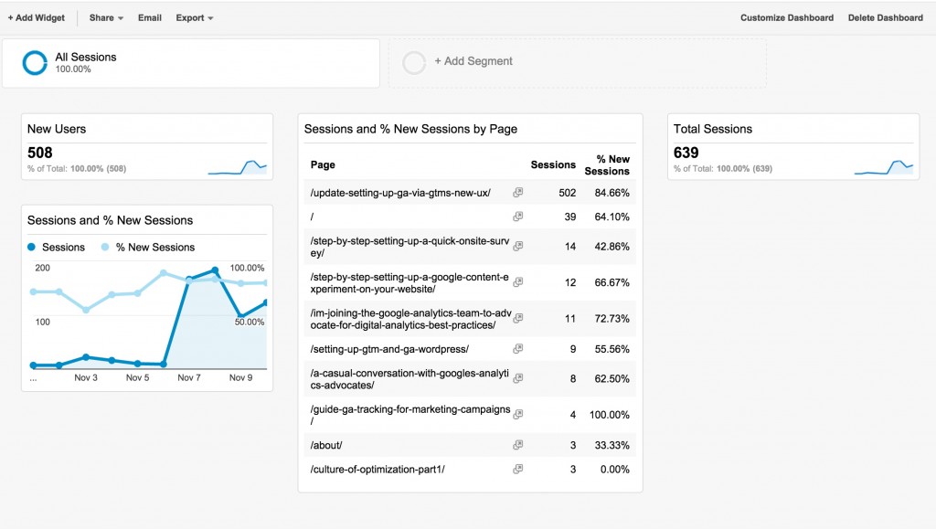
Now that you’ve created a few widgets, it’s time to organize your dashboard to be shown in the best format for you and your business. Dashboards will generally default to a 3 column format, like the below:
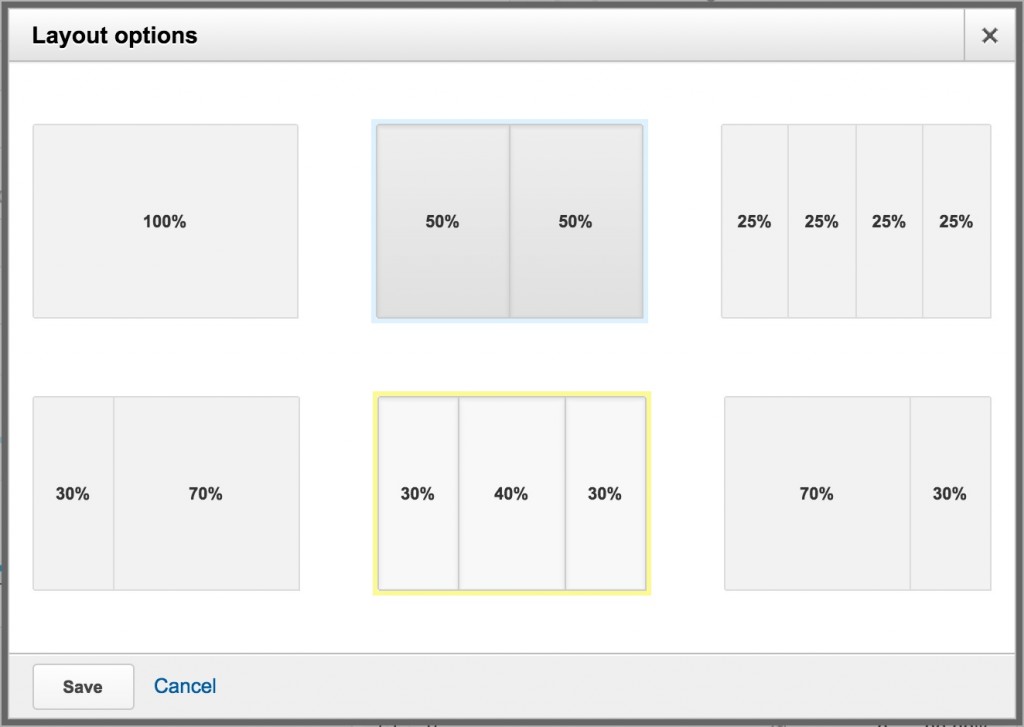
For some people, this is the ideal view, especially if you have several metrics (the single number widget with a sparkline) as these do not take up much room. I personally prefer a 2 column layout though where all the widgets are equal widths. To customize the look and feel of your dashboard, click on ‘Customize Dashboard’ in the upper right hand nav. You’ll see the below popup:
Choose the layout that works best for you and hit save. Next, you’ll want to organize the widgets in the order you think is best for your users. To do this, simply drag and drop each widget to the desired location. When you’re done with this, you’ll have your own customized dashboard view.
Step 4: Segmenting, analyzing and sharing
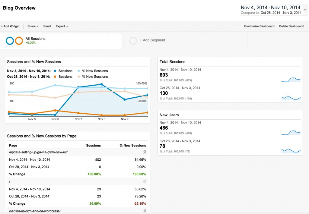
Now that you have a customized dashboard for your business needs, you can segment it and change the date range to help in your analysis efforts. To change the date range, use the date selector in the upper right hand corner. You can even do a comparison time range to see week over week or month over month trends:
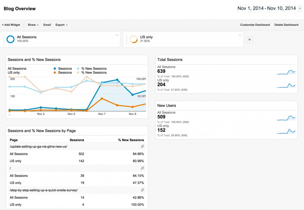
To segment your data, use the segment selector on the top nav. For example, if I wanted to see all of my data compared to just visits coming from the US, I could add a segment to the dashboard that was US only:
Finally, there are a couple of options to share this dashboard with other users and key stakeholders easily. If you are an account admin, you can push this dashboard out to the whole analytics view. To do so, choose Share —> Share Object on the top nav bar:
The other option is to share the template link so others can import this dashboard into their own analytics views, even if they are looking at a different view than the one you made the dashboard in. To do so, choose Share —> Share template link and then send that link to the desired user(s):
That’s it. Happy dashboarding!


David Kamm
Nice and straightforward walk-through, Krista. Thanks. Just queued this up to share today via Buffer.
Martin
Nice post. Thanks.
Brent
I set a dashboard up for a client and it emails PDFs to them on a scheduled basis. Works perfect except that the client wants to see more than 10 rows of data and a dashboard maxes out at 10. Any suggestions? Getting them up and running on GA is the only other thing I can think of but that seems like overkill since they aren’t real technically savy.
Jonathan Hunt
Very late in my reply to you Brent, but one thing you can do is create a duplicate widget, and filter out the first 10 rows.
So as an example, if you want to see your top 20 referrers, simply create a widget to show this… then duplicate it, and create a filter for “Don’t Show” “Source” “Regular Expression” then put in your first 10 referrers “(refrrer1|referrer2|referer3|refrrer4|referrer5|referer6|refrrer7|referrer8|referer9|referrer10)”
In the regular expression you use a blackslash \ to ‘escape’ a dot. So to highlight just 3 it might be “(t\.co|facebook\.com|instagram\.com)”
Hope this makes sense and helps you out!
Mike
Maybey you can help. I also trying to get more than 10 rows. For Organic Searches by Page.
Cloned the widget
edited the new one
Don’t show xxxx Regular Expression
Can’t figure out the RegEx for the first 10 rows of pages 🙁
Pingback: IM Lounge | Step by Step: Setting Up a Google Analytics Dashboard