Deep-Dive: Segment Overlap in Advanced Analysis
This is a follow on post to my first Introducing Advanced Analysis and my second deep-diving on the Funnels technique. If you haven’t checked those ones out yet, do so first.
In this post, I want to walk through getting the most out of the Segment Overlap technique in Advanced Analysis.
The Segment Overlap technique in Advanced Analysis is exciting for many reasons. In my opinion, it really stretches the capabilities of Google Analytics and takes us into a whole new realm of discovery and actionability. What do I mean by that?
Highlights:
- Include up to 3 segments to compare visually and via table what the overlap of users (or whichever metric you desire) is
- Breakdown this overlap by a desired dimension. For example, breakdown the overlap of Organic Traffic and Purchasers by Device Type to find out what breakdown is most valuable
- Create a segment or audience from a desired overlap/breakdown to action on within Analytics 360, Optimize 360, or any of Google’s Ads products (Google Ads or Display & Video 360)
- View users from a drop-off in the Individual Users Report in standard reporting
The power of this report is best illustrated by demoing, so let’s walk through a few screenshots showing some of this functionality. Start by adding your desired segments to your overlap canvas, like so:
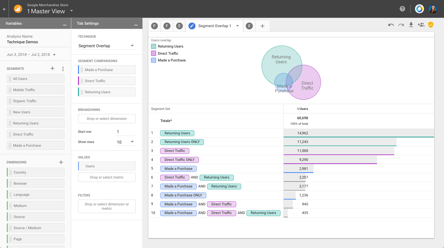
In this case, I’ve started by adding 3 segments to the segment comparison tile under tab settings. To do this easily, simply double click on the segment names you want to add. Here I’ve started with the ‘Returning Users’, ‘Direct Traffic’, and ‘Made a Purchase’ segments. I’m evaluating this by Users, which is noted by the metric ‘Users’ being placed in the ‘Values’ tile.
As you can see, there is a decent amount of overlap between these 3 segments, with both inclusive and exclusive overlaps of each segment. In the center of the Venn diagram, you can see there is a small section which includes overlap of each segment. You can also see this detailed in the table on line 10 where it shows ‘Made a Purchase’ AND ‘Direct Traffic’ AND ‘Returning Users’ with a user could of 435.
I’d like to dig in further to New vs Returning Users, so I’m going to remove the segment for Direct Traffic and Add the one for Returning Users:
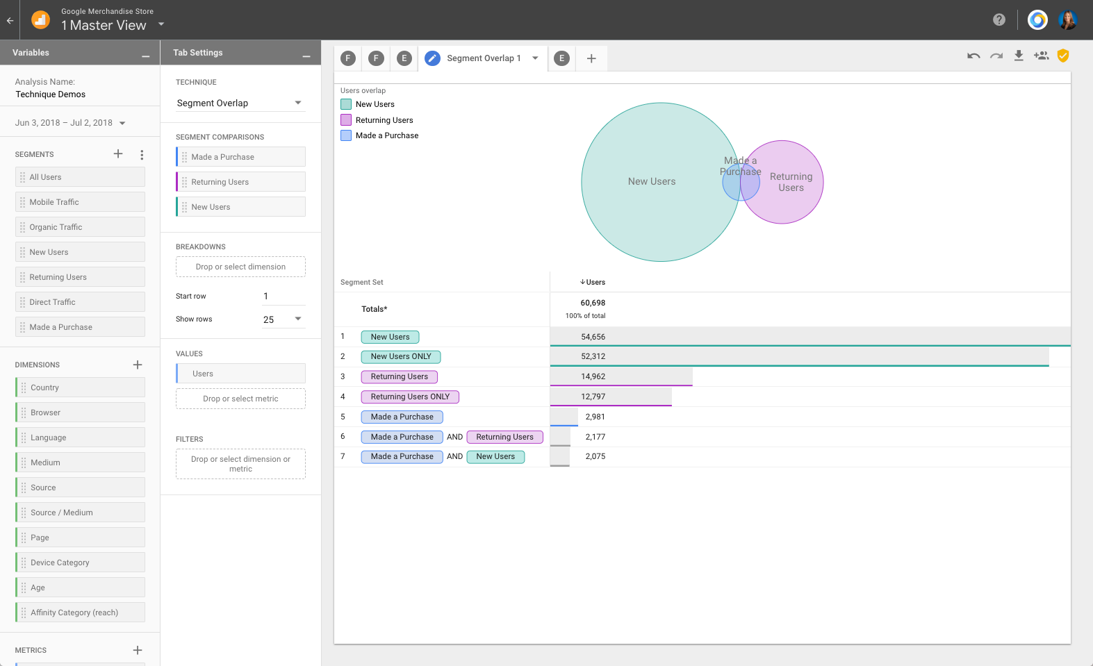
Now we start to see some interesting information. Volume wise, we get significantly more New Users visiting the Google Merchandise Store than Returning Users, however, when it comes to purchases, it’s actually slightly higher in actual numbers (2177 vs 2075) and significantly higher in percentage of users purchasing for Returning Users.
This gets even more telling when we add in the Revenue. I can do that by adding an additional column of data to my table by dragging in the metric for Revenue into the Values tile, like so:

Now I can see that even though almost half of the purchases came from New Users, about 75% of the revenue ($420k out of $557k) came from Returning Users, meaning that Returning Users are a significantly more valuable group of users overall. This insight could be used to make marketing and budgeting decisions on things such as Ad spend. For example, remarketing to previous site visitors may be a better return on investment than spending those same Ad dollars on acquiring new users.
I’d like to point out one more useful feature of the Segment Overlap technique: The ability to add breakdowns (same functionality as in other Advanced Analysis techniques). For example, I can add a breakdown for Device Category. By doing so, I will breakdown each combination of segment by the device category, like so:
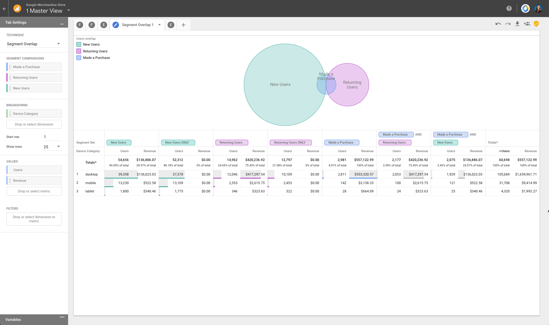
The report will then pivot to show the segment combinations as columns, with sub-columns of each metric being analyzed (in this case, Users and Revenue), and report 1 row for each value of the breakdown, in this case, a row for Desktop, Mobile, and Tablet. Not surprisingly, in this case I see that almost all of the revenue is coming from desktop, but if there was an anomaly for a certain segment grouping, this is where you would be able to see that stand out. Pretty cool!
If you do find an interesting cell of data, or an interesting overlap, you can right click to create a segment or audience from this group of users and use it for analysis, remarketing, or optimization efforts elsewhere across the Google stack. For example, creating a segment from the overlap of ‘Made a Purchase’ and ‘Returning Users’:

In case you want to learn more about how to navigate, use, and make the most of the Segment Overlap technique, check out this YouTube video:
Happy Analyzing!

Randalf
Hi
where can you find this report in GA?
Krista
This is in the Analysis section of Google Analytics 360
Wojtek
HI Krista, this is a great tutorial but can you kindly show where I can find Segment Overlap in google analytics?
Krista
It’s in the Analysis section of Google Analytics 360
Pingback: Digital Debrief – New App + Web Properties in Google Analytics